




Reception signage that sets the right first impression
Scale, lighting and standoff depth matter more than the logo itself. A look at what makes lobby signs work.
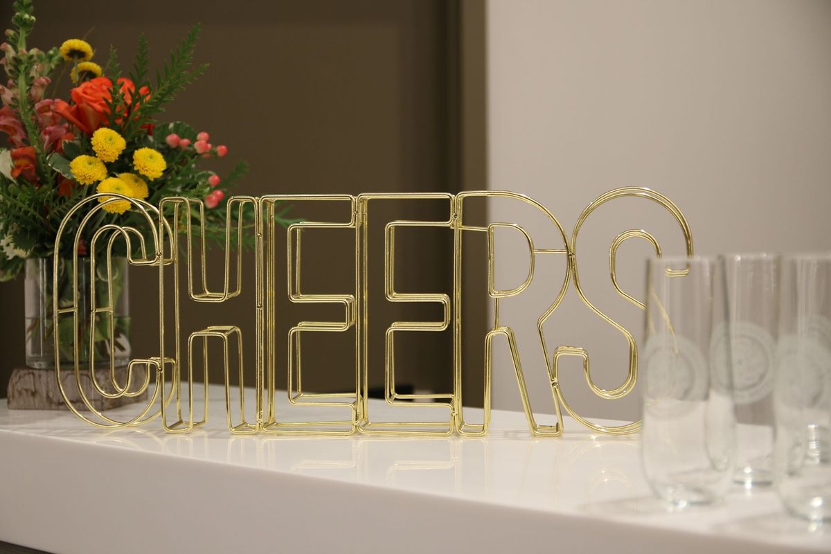
The reception wall is often the first thing a visitor photographs. A few decisions make the difference between a sign that looks right and one that disappears into the wall.
Scale
Measure the wall and the distance from the entrance. A logo that looks large on screen can feel small in a real room, so we mock it up on a photo of your space first.
Standoff depth
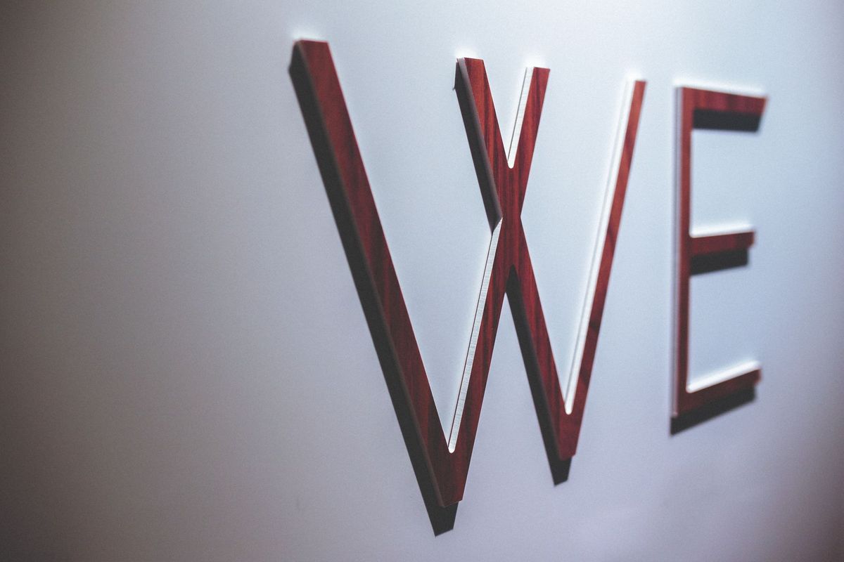
Mounting letters 10 to 30 mm off the wall creates shadows that give depth. Deeper standoffs work well with halo lighting.
Materials
Layered acrylic suits colourful logos, brushed steel feels corporate and timber brings warmth to studios and hospitality spaces. Mixing a metal face with an acrylic back layer is a popular combination.
Lighting
Downlights, halo-lit letters or a subtle LED backlight help the sign stand out and photograph well at any time of day.
Around the logo
Coordinated door plates, floor directories and meeting room signs keep the look consistent as visitors move through the building.